Graphic Project 1
EDET 703 - Spring 2011
Design and Development Tools II




My first name in black text.
My first name in red text.
My first namewith 50% opacity.
My first name with the levels reduced.




My first name in black text.
My first name in red text.
My first namewith 50% opacity.
My first name with the levels reduced.
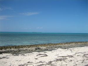
Tropical Beach - original photo
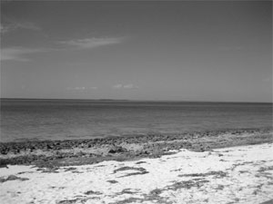
Tropical Beach in black and white.
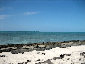
Tropical Beach - watercolor
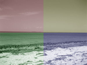
Tropical Beach - four colors
Rollover Picture
Roll the mouse over the picture to see it change.

Reflections
For graphic assignment 1, I used Photoshop Elements v6. Thankfully, I had some experience using this from Dr. Smyths course (EDET 603) last semester, so the concepts of layers and opacity were not new. I was able to easily create the text for my names, duplicate the layer, and modify it. Several times, I forgot to turn off layers or choose the correct layer, so I would head down a rabbit hole modifying the wrong thing. In those cases I am so thankful for the Undo command. (Ive actually found that true for most of the work I do with computers, my left hand often lives right over the command-Z shortcut combination!)
This was the first time I had used the simplify layer command, which changes the text layer into an image. However, when I tried to reduce the brightness and contrast of the simplified layer, it seemed to make no change. I ended up using the change levels option instead. Im still not sure why the brightness control did not have any effect.
I used Dreamweaver to build my pages. I borrowed much of the design from my personal pages, including a simple css file. In retrospect, I think I would have chosen a smaller size for my name image. My final product fits within the 300 pixel limit, but it is a little on the large size. Dreamweaver made creating a rollover image quite simple. After I put it in, I noticed a bunch of extra code in my html file, which I assumed was needed for the rollover. Ill need to look at that further - I dont like the idea of code being there if I dont know exactly what it does.